
Think of the last time you handed over your credit card details online without a second thought. Or the time you willingly typed your email into a form, confident you’d get something valuable in return. That moment of unhesitating action is the quiet victory of a well-built website.
In our work, we’ve moved past debating colours and fonts. We discovered that the real work lies in engineering trust.
A trustworthy site operates like a calm authority. It answers questions before they’re asked, resolves doubts before they form, and systematically removes the little hurdles that make a visitor hesitate. This is what drives real conversions.
Over the years, we’ve identified seven tactics that create this effect. They all revolve around understanding basic human expectations in the digital space. Let’s explore them.
1. Front-Load Your Value Proposition
The single most effective way to build immediate trust is to demonstrate you understand the visitor’s core intent. They arrive with a goal, and your first job is to acknowledge it and provide a direct path to its fulfillment.
A website that makes users hunt for its primary service signals confusion or obfuscation. On the other hand, placing the most valuable tool or answer at the very forefront demonstrates your competence and respect for the visitor’s time.
This reduces bounce rates and primes the user for a cooperative relationship, directly increasing the likelihood of conversion.
To implement this:
- Identify the primary action for your majority audience. Is it to search, to calculate, to learn a key fact, or to see examples?
- Make this element visually dominant, requiring no scrolling on a standard desktop view.
- Use clear, directive language. Instead of a generic “Welcome,” label this area with a benefit-oriented header like “Find Your [Solution] Now” or “Start Your [Process] Here.”
- Ensure the functionality is intuitive and fast. Any friction here will break the spell of trust you’re trying to cast.
Let’s take a look at how this works in the real world:
John Campbell is a residential real estate expert. His website’s header features a prominent, detailed property search tool immediately below the main navigation. The moment the page loads, a visitor can input their desired location and filter the results by price or square feet.
This direct access communicates confidence in the quality and accuracy of the listings. The website confidently leads with its core service, bypassing lengthy introductory copy.
This approach successfully encourages visitors to continue moving through the sales funnel, thus generating significantly higher-quality, ready-to-engage leads from the first interaction.
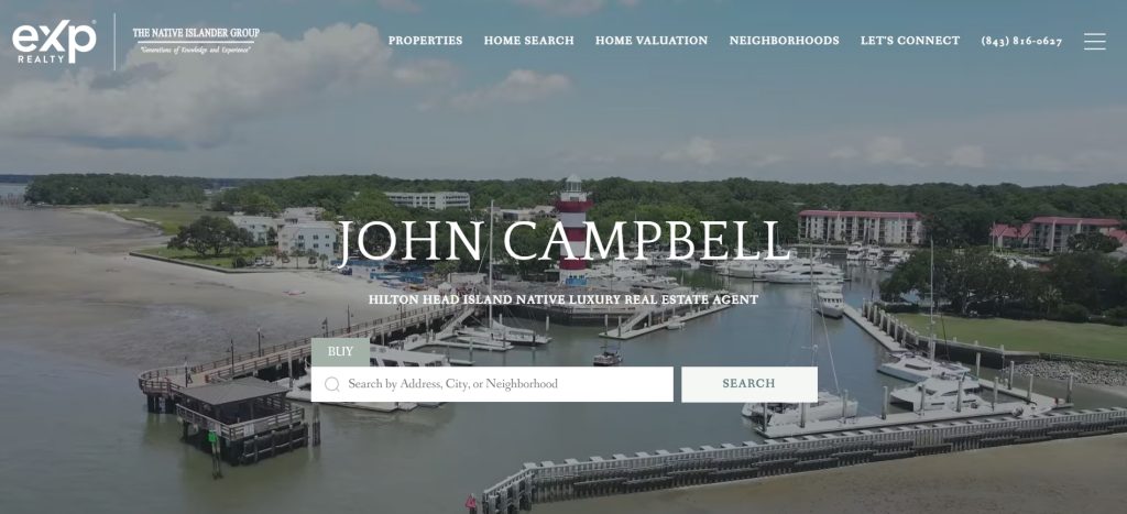
Source: johnsellshiltonhead.com
2. Leverage Unfiltered Social Proof
Your marketing claims are expected. A stranger’s validation is not. This is why 92% of consumers globally trust user recommendations more than any branded content.
Authentic social proof bypasses skepticism because it serves as evidence, not promotion. It transforms your service from a promise into a proven outcome. Displaying real feedback demonstrates transparency and builds credibility by letting your results speak through a neutral third party.
To implement this:
- Source testimonials from verifiable platforms like Google Reviews, Yelp, or industry-specific sites.
- Avoid overly polished, perfectly phrased quotes. Genuine language is more convincing.
- Display them prominently, ideally near key decision points like pricing or contact sections.
- Include the reviewer’s full name, photo if possible, and the platform logo.
- For maximum impact, categorise them by service type or client concern. Prospective clients will seek out reviews that mirror their own situation.
- Video testimonials are particularly powerful, as they are nearly impossible to fake and convey raw emotion.
As an example, take Freeburg Law, a firm specialising in personal injury and criminal defense cases – fields where trust is paramount.
Directly below their homepage header, they feature a revolving carousel of Google reviews. Each testimonial is shown in full, using the client’s own words, complete with the star rating they left. This strategic placement ensures that the first thing a potential client sees, after understanding the firm’s services, is independent confirmation of their competence and client satisfaction.
This immediate display of unfiltered praise directly addresses the anxiety and scrutiny inherent in choosing legal representation, significantly lowering the barrier to initiating contact.
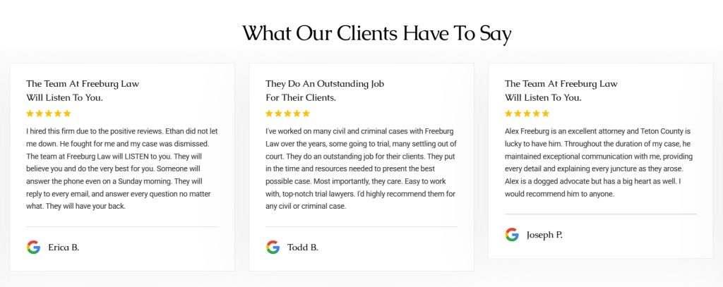
Source: tetonattorney.com
3. Validate with Credible Evidence
In sectors crowded with bold claims, trust is earned by demonstrating a foundation in fact. Assertions about performance, safety, or results require external validation to be believed. Credible evidence moves your proposition from subjective opinion to objective reality.
This is especially critical in industries where the product is complex, the investment is significant, or the outcome carries personal risk. Referencing research, data, or expert endorsement provides a rational basis for trust that resonates with discerning visitors.
To implement this:
- Integrate evidence directly into your key messaging. Don’t relegate studies to a footnote.
- Feature relevant statistics, clinical trial results, or certification badges adjacent to your core claims.
- Use clear, concise language to explain what the evidence means for the user.
- Whenever possible, cite the source institution (e.g., “A 2023 study published in the Journal of X found…”) and provide a direct link to the abstract or report.
- If possible, include brief video commentary from a relevant expert, such as a scientist or clinician. This adds a layer of human authority that pure text cannot.
A clear example here is Mind Lab Pro, a provider of universal nootropic supplements designed to support cognitive function. Their homepage dedicates a section to the science behind their product, which explicitly bridges their claims to research.
They present specific, tested metrics for improvements in focus and memory. This data is supported by a video featuring a medical professional discussing the mechanisms from an academic perspective. They also link directly to published medical studies that substantiate the efficacy of their key ingredients.
This transparent aggregation of evidence directly addresses the skepticism in the wellness and supplement market, transforming their product from a mere pill into a researched formulation and establishing legitimate authority.
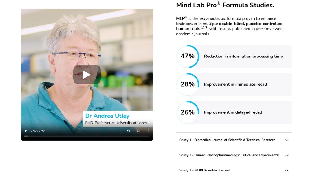
Source: mindlabpro.com
4. Show Who Already Trusts You
Association is a powerful shorthand for credibility. Displaying logos of recognised, reputable organisations you’ve served creates instant validation. It signals that your business has passed the rigorous vetting and quality standards of established market leaders.
For a new visitor, this acts as a pre-approval, reducing perceived risk. It answers the implicit question, “Who else trusts you?” with tangible proof, elevating your own brand’s status by reflection.
To implement this:
- Secure explicit permission from clients to use their logos.
- Feature them in a clean, organised grid, not a chaotic collage.
- Prioritise quality over quantity. Three to five highly recognisable brands are far more impactful than twenty obscure ones.
- Place this logo section strategically, such as near your value proposition or above your portfolio.
- Ensure the logos are high-resolution and link to the clients’ websites if available.
- Context is key. A simple phrase like “Trusted by” or “Partnered with” frames the section correctly without boasting.
Custom Sock Lab, a manufacturer specialising in custom-branded socks for corporate promotions and private events, uses this tactic effectively. Directly below their homepage hero, they feature a clean, bold grid of client logos.
When a visitor immediately sees the iconic marks of Meta, MrBeast, and Brooks, the effect is instantaneous. It communicates that the company operates at a level of quality and reliability demanded by global tech giants, top-tier influencers, and major athletic brands.
This visual endorsement tells prospective clients that they’re engaging with a serious, vetted provider. It transforms the service from a simple commodity into a professional choice, encouraging visitors to aspire to be part of that same esteemed group.

Source: customsocklab.com
5. Highlight Who’s Talked About You Publicly
While showcasing client logos demonstrates commercial trust, displaying earned media logos provides editorial validation. This is the distinction between being chosen by peers and being recognised by authorities.
A feature in a respected publication acts as a powerful, impartial review. It tells visitors that your work or insight is notable enough to be vetted and highlighted by an independent institution with its own reputation to uphold.
To implement this:
- Actively compile every instance of media coverage.
- Create a dedicated “As Featured In” or “Mentioned By” section.
- Use the official logos of the publications, ensuring they are displayed with consistent quality and size.
- Always link the logo to the original article. This transparency proves the mention is genuine.
- Place this section prominently, often in the homepage header or footer, or on a dedicated “About” page.
- For maximum impact, pull a compelling, concise quote from the article to accompany the logos, framing the context of the feature positively.
A brand that uses this strategy is Socialplug, an online marketplace for social media engagement services, such as followers and likes. Operating in a niche often viewed with skepticism, their credibility is paramount.
Directly on their homepage, they feature a clean “Featured in top media” section showcasing the logos of major media outlets like Forbes, Business Insider, and HuffPost. This strategic display immediately counters doubt by associating the brand with the rigorous editorial standards of these well-known names.
For a potential customer hesitating about the legitimacy of such a service, seeing that Forbes has mentioned the company provides a significant layer of external legitimacy. It transforms the brand’s narrative from a simple service provider to an industry-recognised platform.
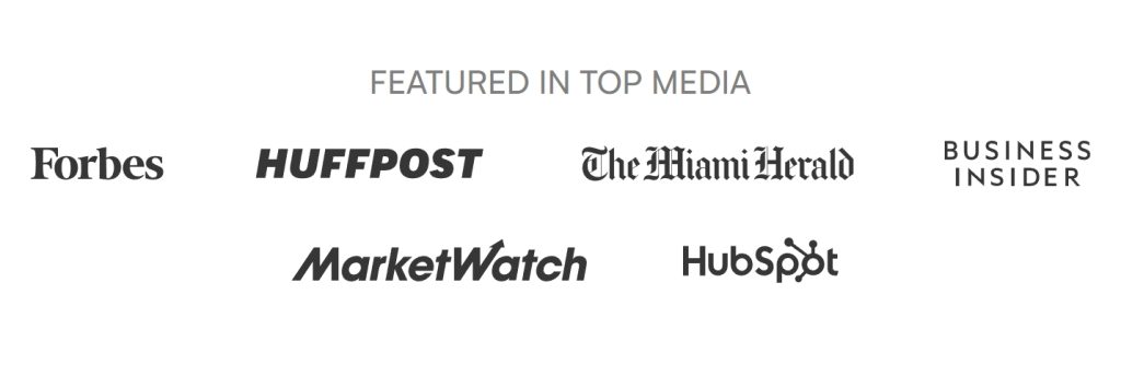
Source: socialplug.io
6. Demonstrate Results with Context
Case studies are the definitive bridge between a claim and a proven outcome. They provide the narrative that raw testimonials and logos cannot, detailing the specific challenge, your solution, and the measurable impact.
In a crowded market, detailed results carry decisive weight. They offer tangible proof of your ability to deliver, moving a visitor from interest to conviction. So, it’s no surprise that over 62% of marketers identify case studies as a top lead-generation tool.
To implement this:
- Structure your case studies around a clear before-and-after framework.
- Start by defining the client’s initial problem, then explain your strategic intervention, and conclude with quantifiable results.
- Use direct quotes from the client to add authenticity.
- Always include specific metrics, such as percentage increases, time saved, or revenue gained.
- On your website, don’t bury full PDFs.
- Feature compelling excerpts on relevant service pages with clear headlines, key metrics, and a prominent link to the full story. This invites deeper engagement from genuinely interested prospects.
Trello, a visual platform for project management and team collaboration, executes this masterfully. Their homepage dedicates space to showcase excerpts from in-depth case studies.
These excerpts are not vague success stories. They pinpoint exactly what clients, from startups to large enterprises, found valuable. They feature direct quotes from these clients’ representatives and, most importantly, include specific metrics on efficiency gains or time saved. Each excerpt serves as a high-conviction entry point, linked to a comprehensive case study for those seeking full detail.
This approach allows Trello to demonstrate its versatility and proven impact across industries directly on the landing page. That builds trust through demonstrated expertise rather than simple assertion.
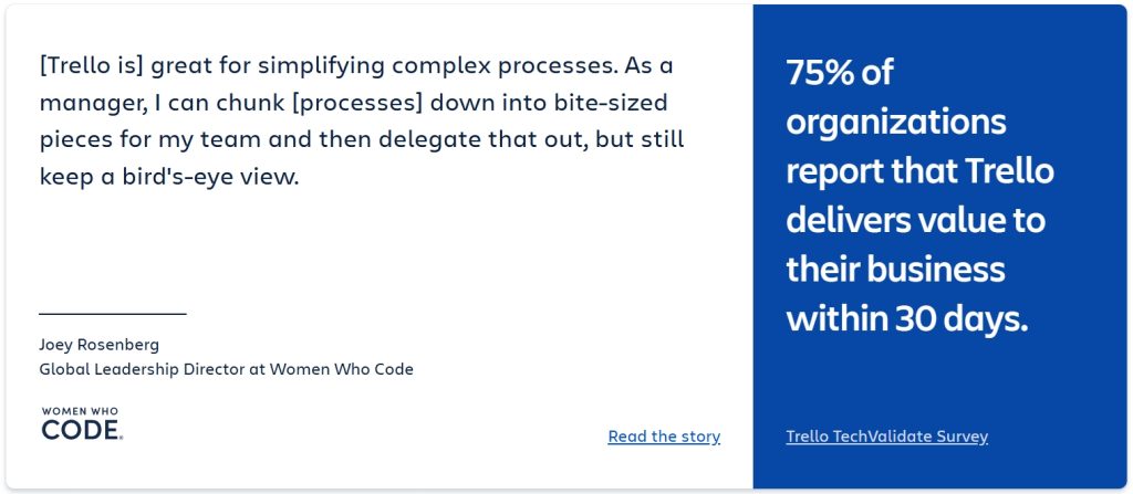
Source: trello.com
7. Eliminate Pricing Ambiguity
Transparency in cost is a direct measure of your confidence and respect for the buyer. Hiding pricing creates friction, forces users to engage in a sales process before they’re ready, and breeds immediate distrust.
Research indicates that companies with obvious, accessible pricing can see conversion rates increase by up to 50%. Clear pricing qualifies your traffic efficiently, respects the user’s time, and establishes a foundation of honesty from which a commercial relationship can genuinely begin.
To implement this:
- Create a dedicated “Pricing” page linked prominently in your main navigation.
- On this page, present your plans in a simple, comparative format.
- Use concise, benefit-driven bullet points to detail what’s included in each tier.
- Display the actual price prominently, and if you offer billing cycles (monthly/annual), provide a clear toggle so the user can see both options without hidden calculations.
- Avoid vague terms like “Contact Us” as the only option for core plans. Reserve that for large enterprise custom solutions, and label it clearly as such.
An example of this is Makeform, an AI-driven platform for creating and managing online forms and surveys.
They understand that their users need to evaluate cost against features quickly. So, instead of burying their pricing, they feature a clear section directly on their homepage outlining three distinct tiers: Free, Pro, and Enterprise. Each plan is broken down with specific feature limits and capabilities, the exact monthly or annual cost is stated plainly, and a toggle lets users instantly see the savings of annual billing.
This upfront clarity accomplishes two things: it instantly filters out incompatible users and empowers serious prospects to make an informed decision without hesitation. This drastically shortens the path to conversion by removing a major point of uncertainty.
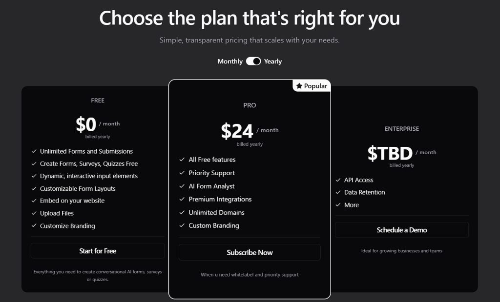
Source: makeform.ai
Final Thoughts
These seven elements are not isolated tricks. They form a cohesive system for building digital trust. Each one addresses a fundamental doubt a visitor carries, from “What do you do?” to “Can you prove it?” and “What will it cost me?”
Implementing even a couple of these tactics will shift your site’s perception from a simple digital brochure to a credible authority.
So, start by auditing your own site against this list. Identify the single point where a visitor’s confidence is most likely to waver, and address it with clarity. Build that trust systematically, and you’ll find your conversions are no longer a matter of chance.
PS: Are you receiving free publicity opportunities, straight into your inbox?
No?!! (Wha?)